Little Wonders
Concept development, logo and identity design
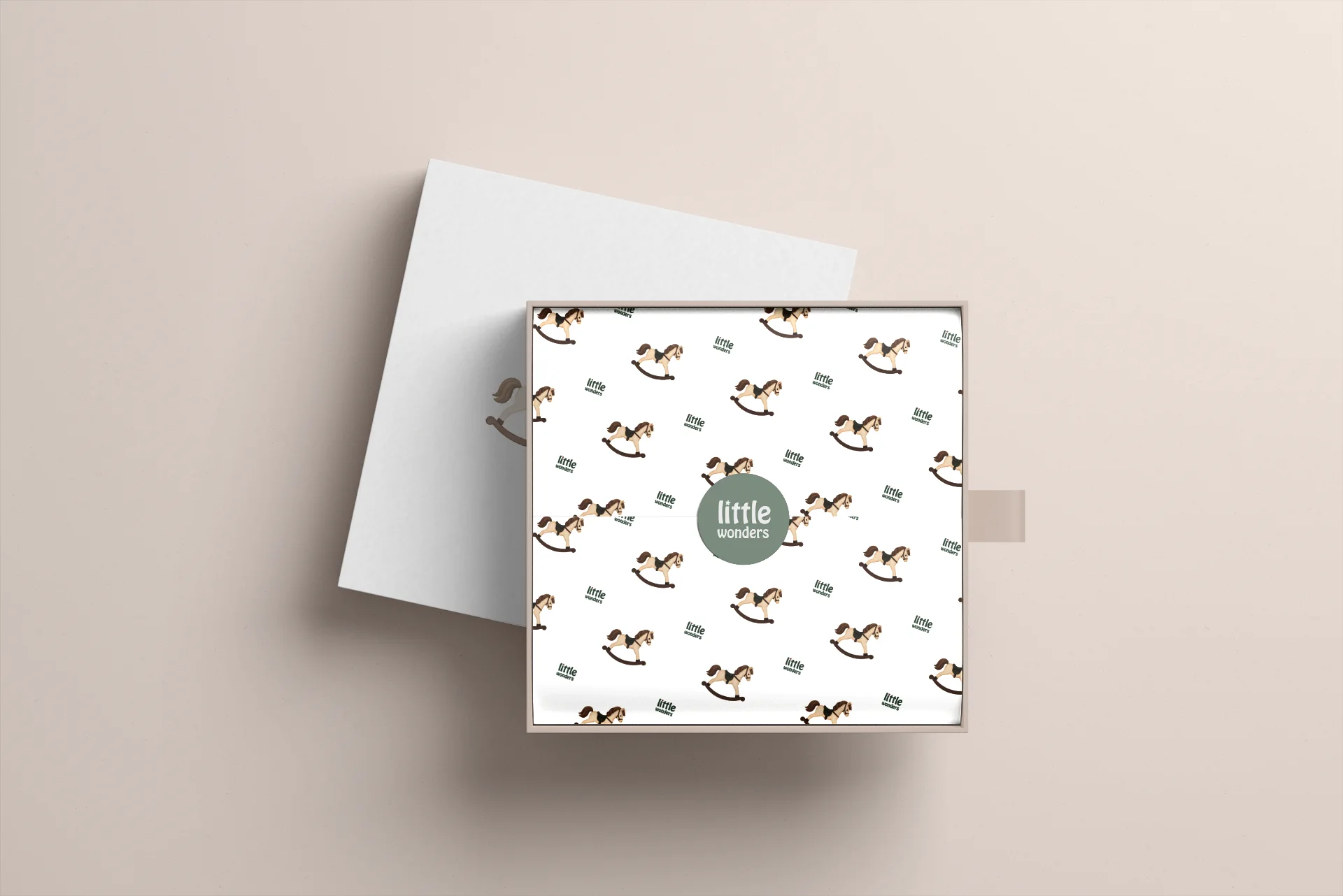
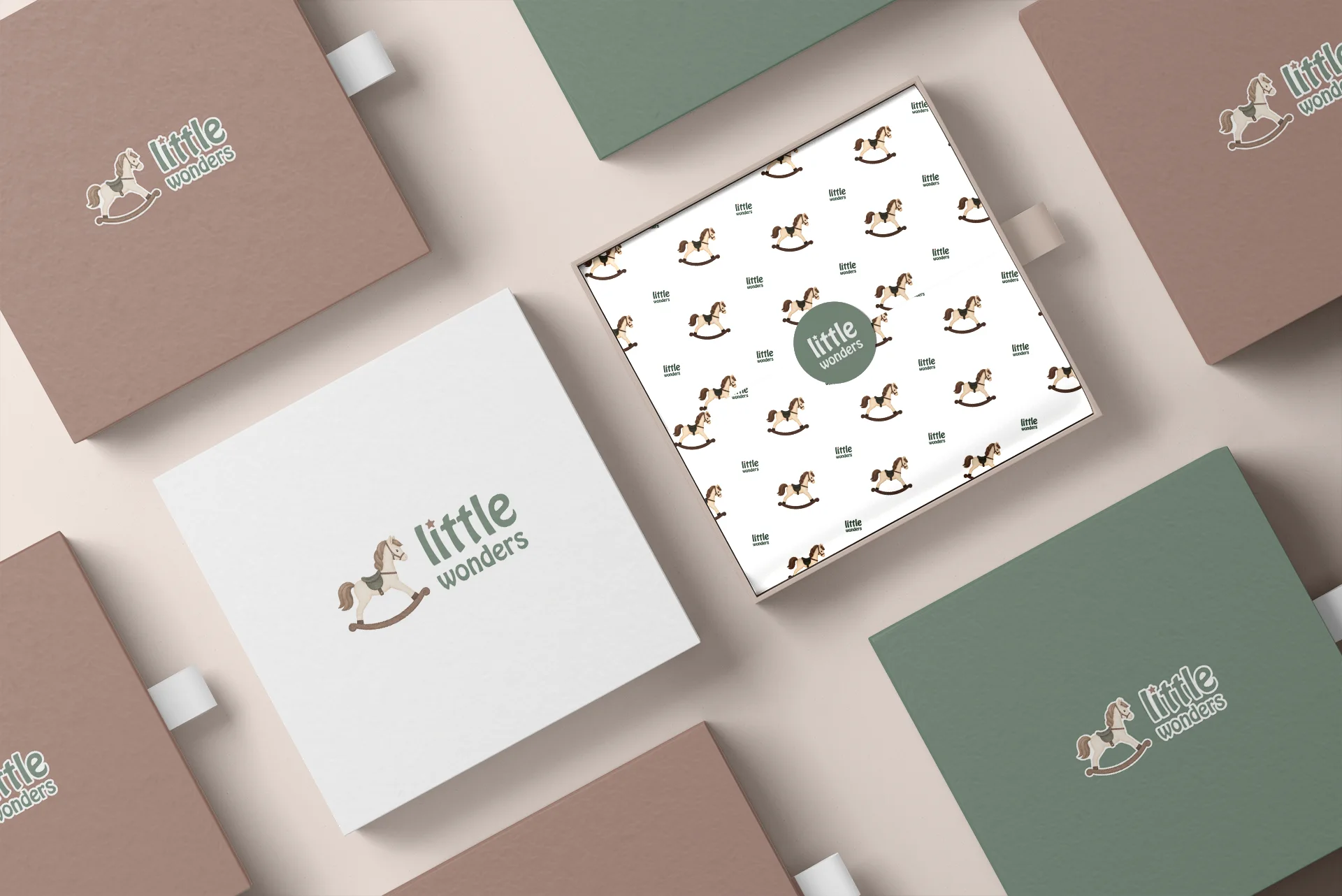
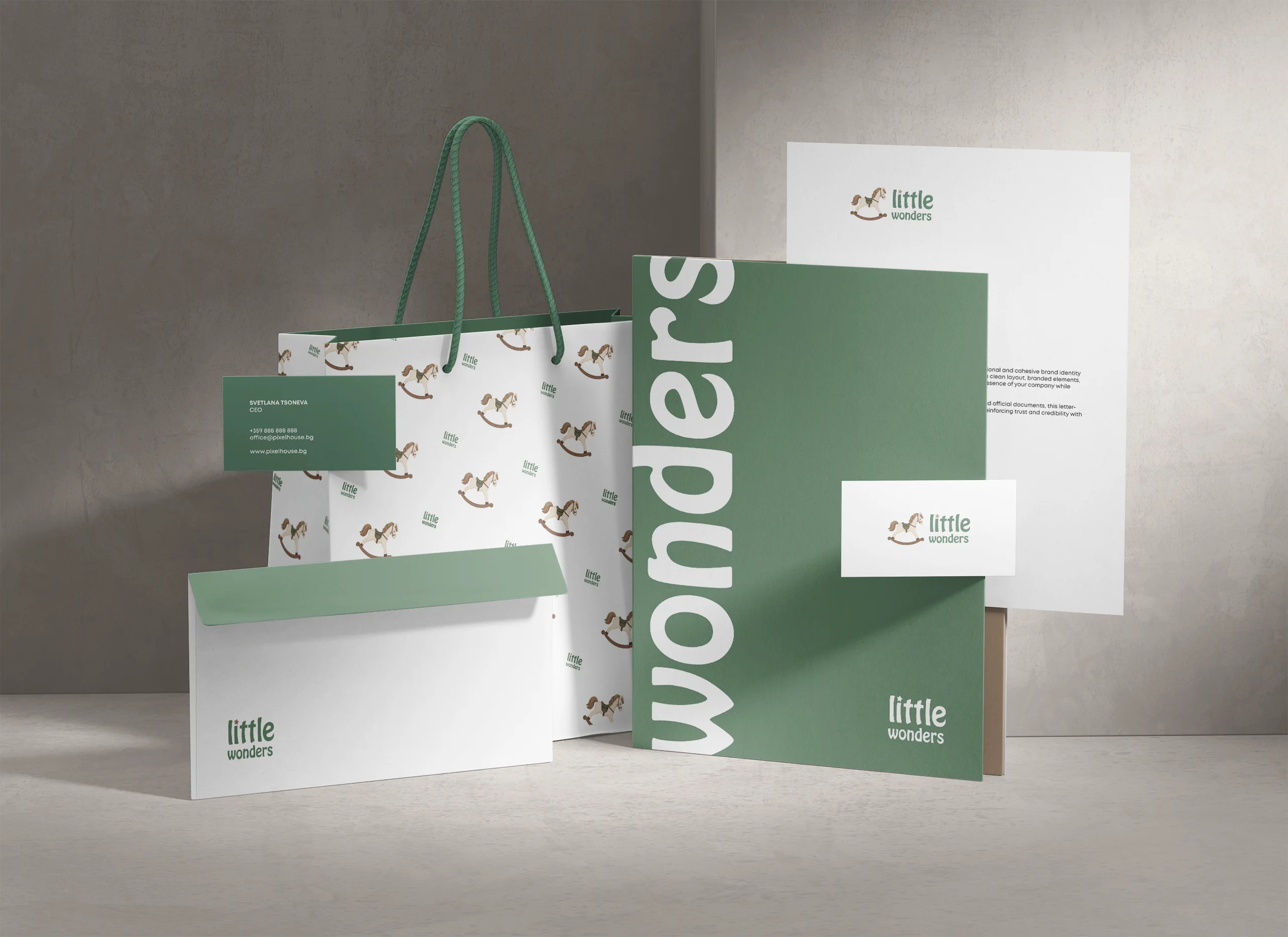
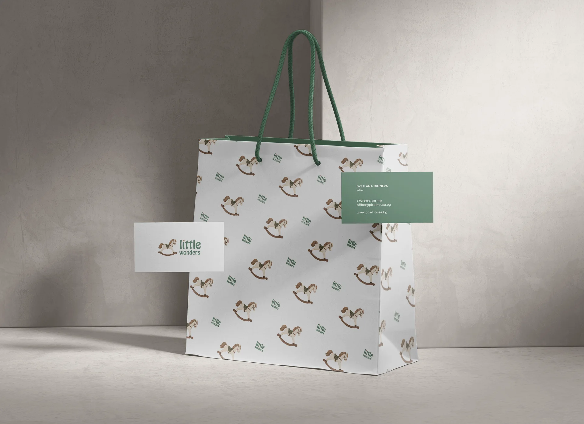
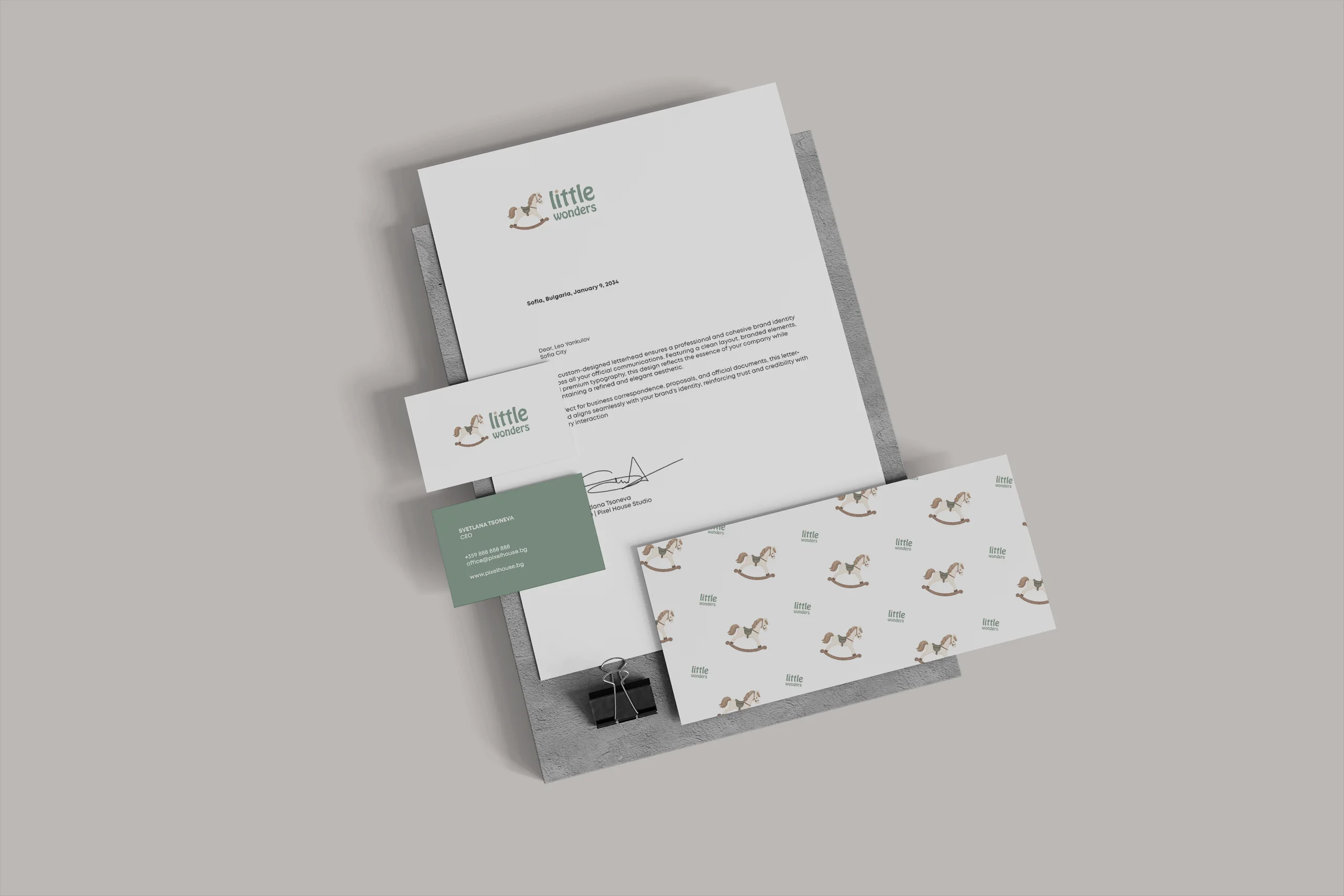
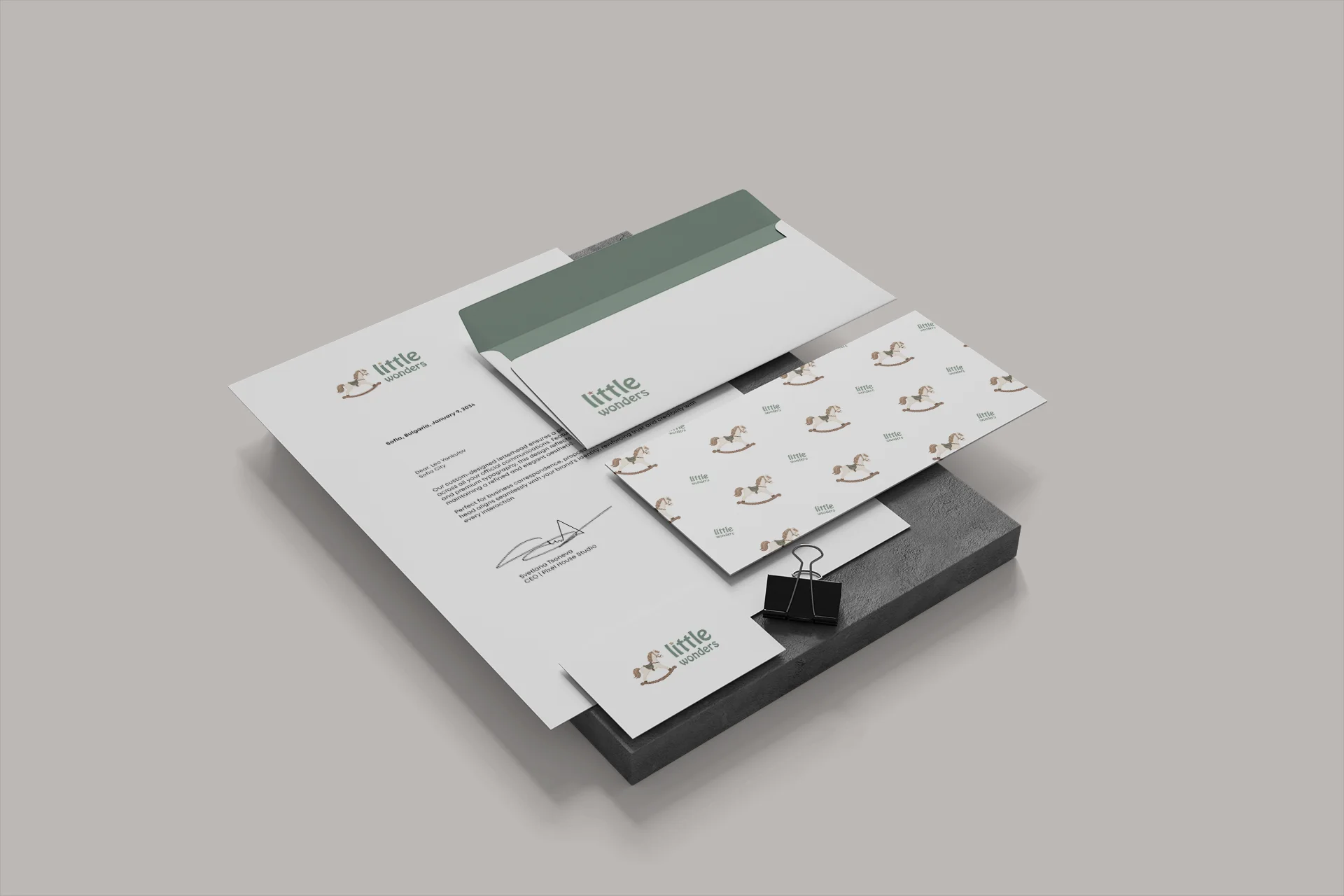
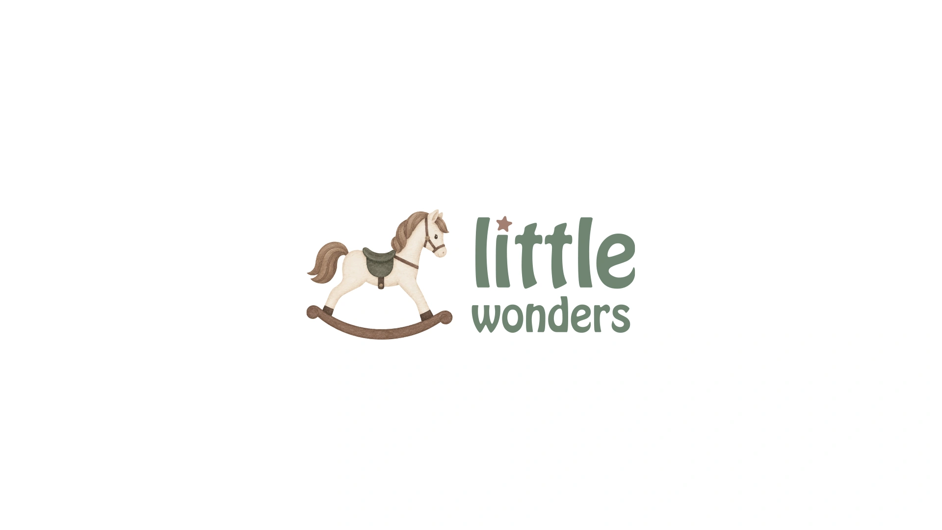
Pixel House developed a logo redesign for Little Wonders, aiming to create a more recognizable and distinctive visual identity for the brand. The concept reflects the natural essence of wooden toys through a texture reminiscent of hand-applied paint, alongside symbolism inspired by a wooden rocking horse. The minimalist typography combines a clean aesthetic with a playful, creative feel—perfect for a brand centered on the world of children.
The color palette features soft, muted shades with an emphasis on earthy tones, enhancing a sense of naturalness, warmth, and a connection to nature. Every element of the new logo design has been selected to reflect Little Wonders’ focus on natural materials and a sustainable approach to children’s toys. The result is a distinctive visual identity that combines minimalism, playfulness, and a natural aesthetic.
Logo & Redesign
Little Wonders Client | 2026


BEFORE
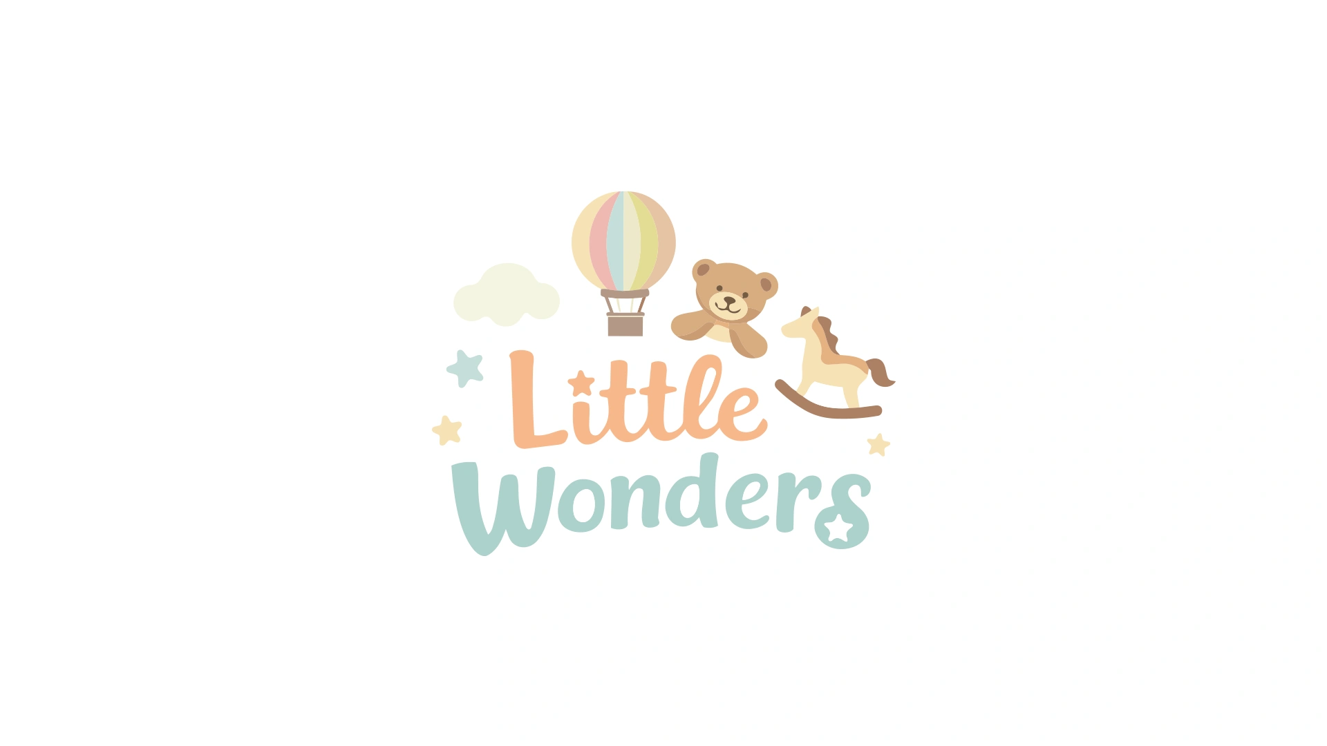
The original logo, as it stands—with potential for various improvements, such as readability, typography, balance, and a more modern look.
AFTER PIXEL HOUSE
Logo redesign by Pixel House – a refreshed look aligned with the brand, clearer typography, and enhanced aesthetics for a stronger visual impact.

”Thank you for the wonderful logo, for the love and professionalism you bring to your work, for your valuable guidance throughout the process, and for your quick response!
It was a true pleasure working together, and we would gladly choose you and your team again for future projects.
Gergana Bonev
CEO, Little Wonders
Do you want to create a
new brand together?
Or should we rebrand and improve your current brand?


Hapnitsa
Hapnitsa

Enthusiast Branding
Enthusiast Branding

BizDonut Branding
BizDonut Branding

Top Hospital Services Branding
Top Hospital Services Branding

Renaissance
Renaissance

H2O Kids
H2O Kids

Sofel-Mr logo redesign
Sofel-Mr logo redesign

Sematik Branding
Sematik Branding

Imagine You