BizDonut
Concept development, logo and identity design
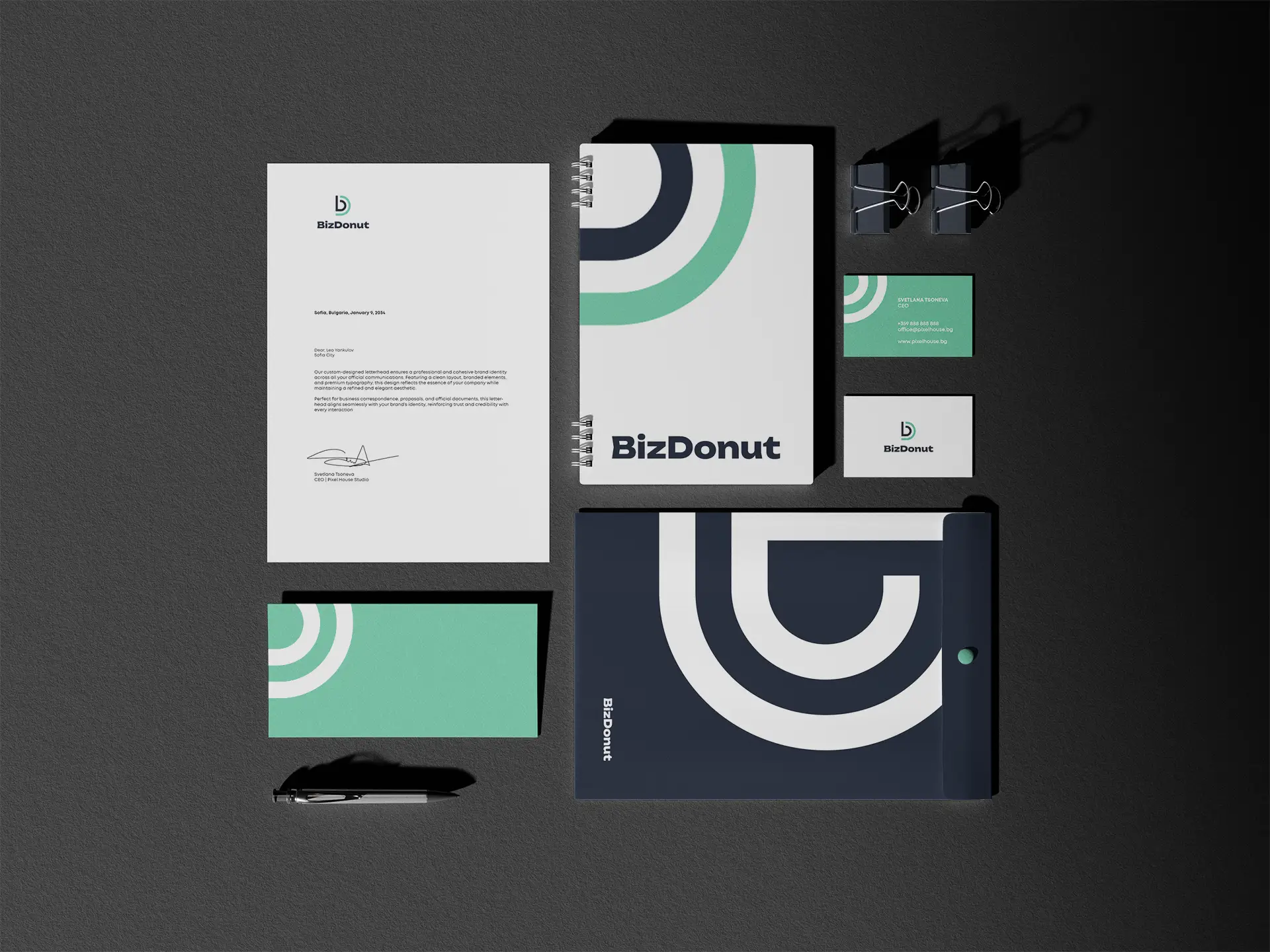
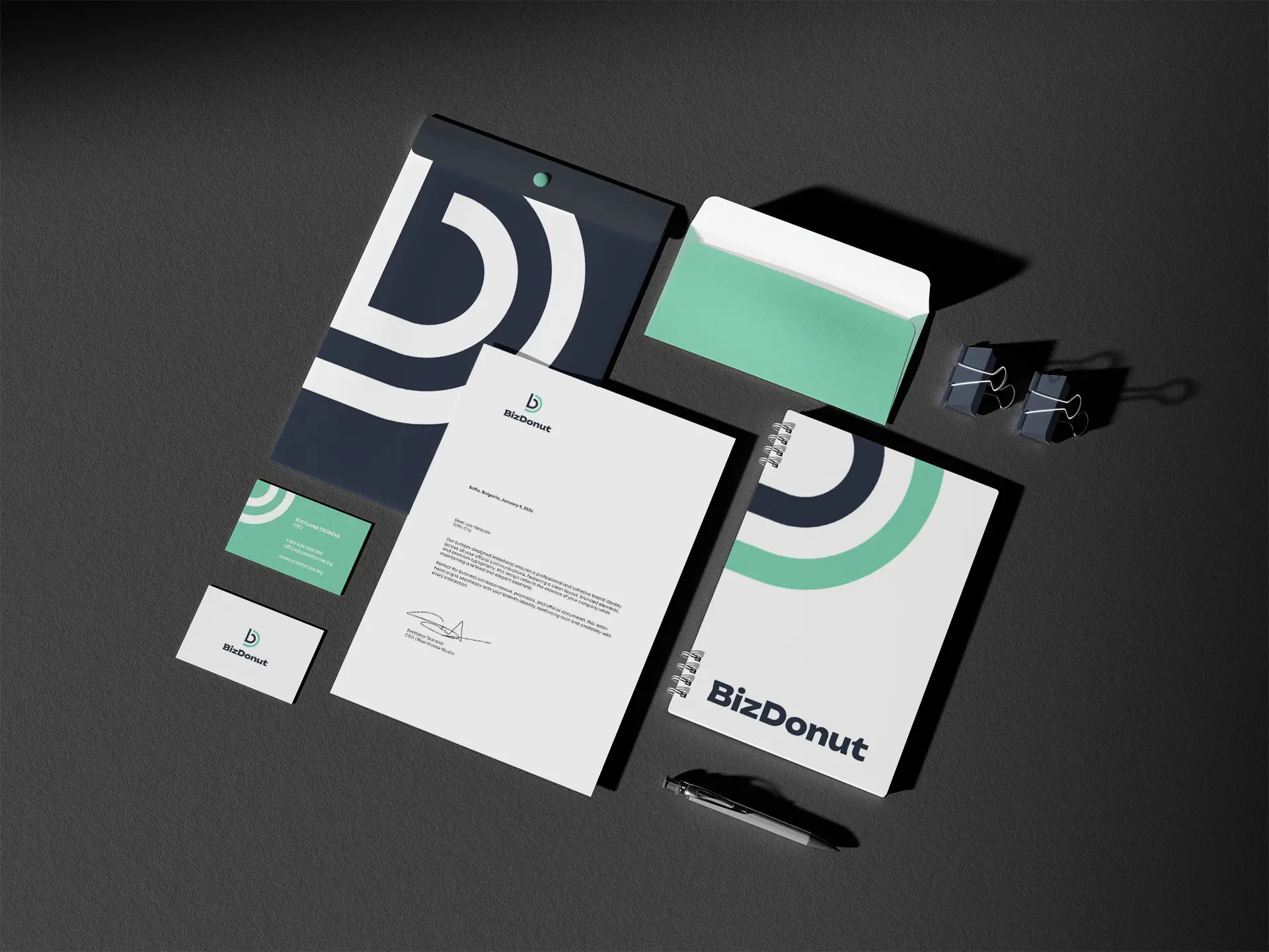
Pixel House created a new corporate identity and logo for BizDonut, combining creative typography with a modern visual style. The logo design uses a distinctive logomark, influenced by the shapes and lines of typography, which builds a recognizable and consistent brand image. The main color palette is made up of blue shades, selected to inspire trust, stability and a sense of freshness.
The corporate identity unites typography, colors and graphic elements into a complete visual system, adapted for digital and print formats. The new vision creates a modern and professional presence, while maintaining clear communication and easy brand recognition across all channels.
Crafting Concept, Logo Design & Brand Identity


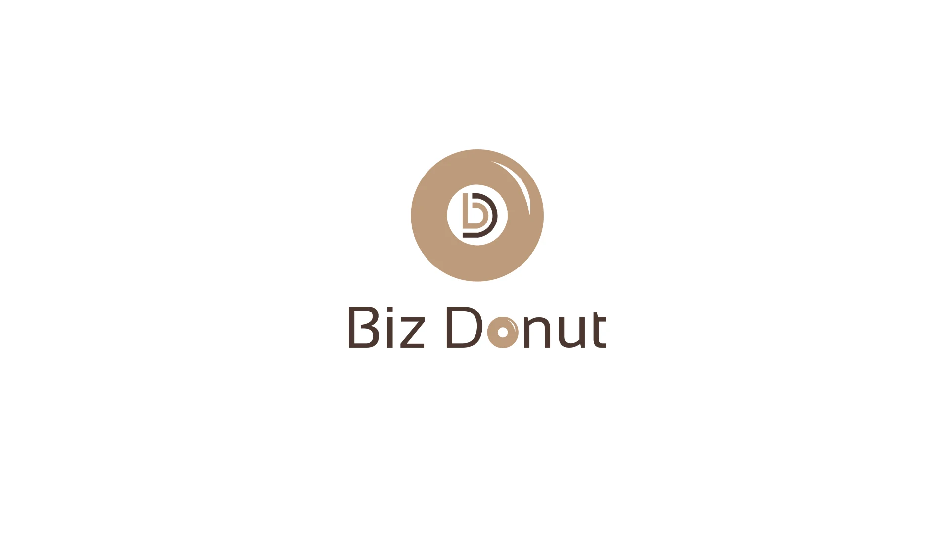
BEFORE
The original logo, up until now – with potential for various improvements such as readability, typography, balance, and modern appeal.
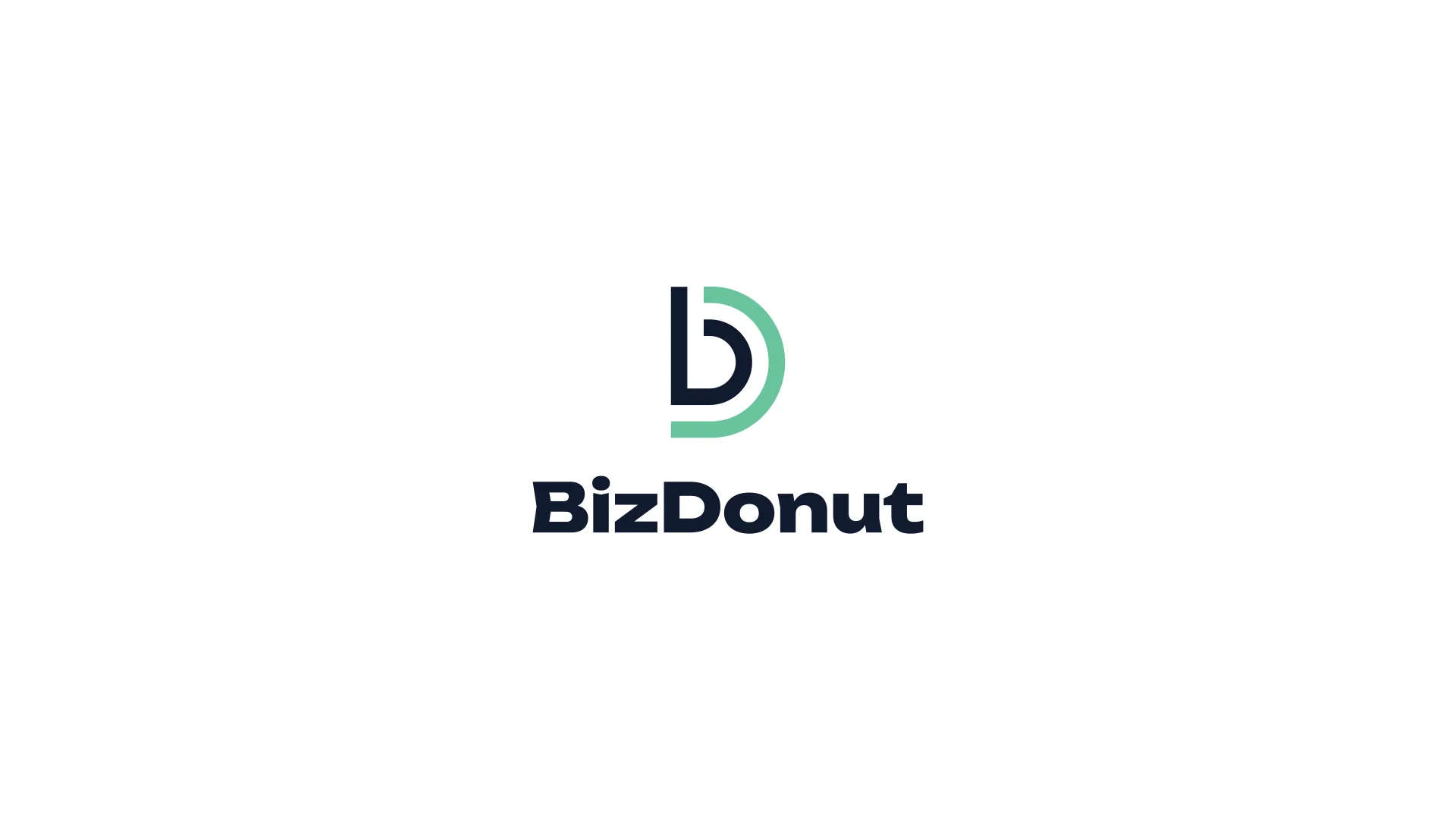
AFTER PIXEL HOUSE
The Pixel House logo redesign – a refreshed vision aligned with the brand, clearer typography, and improved aesthetics for a stronger visual impact.
Viktor Todorov
bizdonut.com
”Pixel House Studio did a great job rebranding our consultancy business, BizDonut.com. We tested the new brand with over 20 companies from our target profile, and the feedback was excellent.
In our view, what sets Pixel House apart is their team's ability to understand the business context and guide us toward the right path, drawing on their extensive experience. We also appreciated how well-organized and thoughtfully delivered all the files were — it really showed their attention to detail and professionalism.
We highly recommend Pixel House to anyone looking for a creative, professional partner for their brand!
Do you want to create a
new brand together?
Or should we rebrand and improve your current brand?


Enthusiast Branding
Enthusiast Branding

Top Hospital Services Branding
Top Hospital Services Branding

Renaissance
Renaissance

H2O Kids
H2O Kids

Sofel-Mr logo redesign
Sofel-Mr logo redesign

Sematik Branding
Sematik Branding

Imagine You
Imagine You

Solur
Solur

ATG Design logo redesign