Renaissance
Concept development, logo and identity redesign
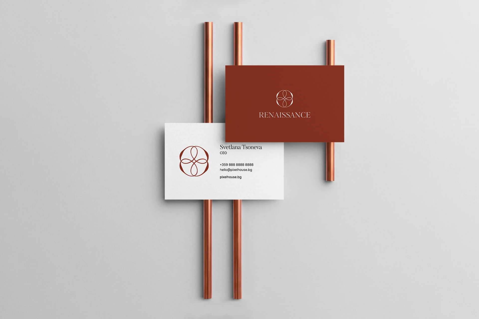
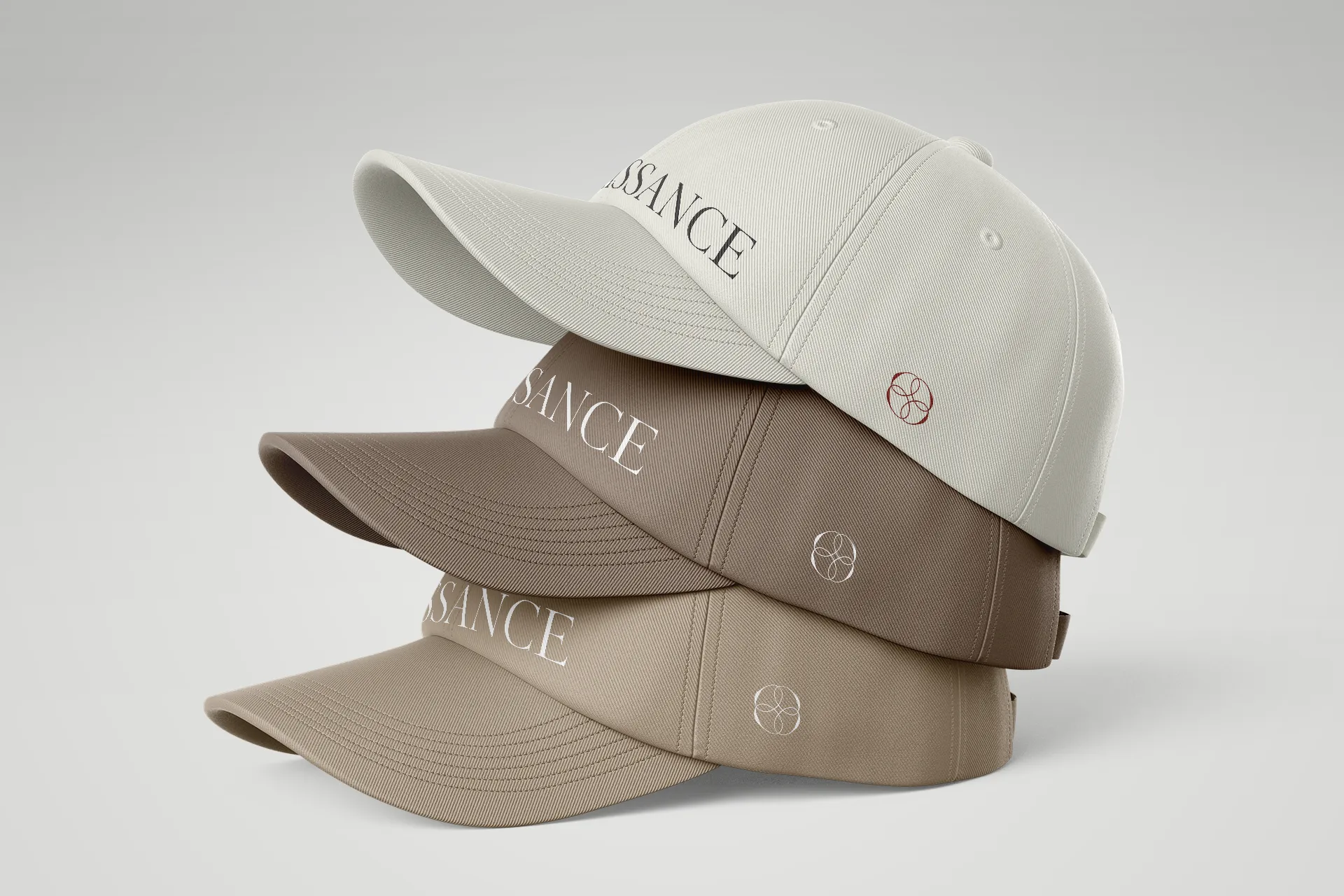
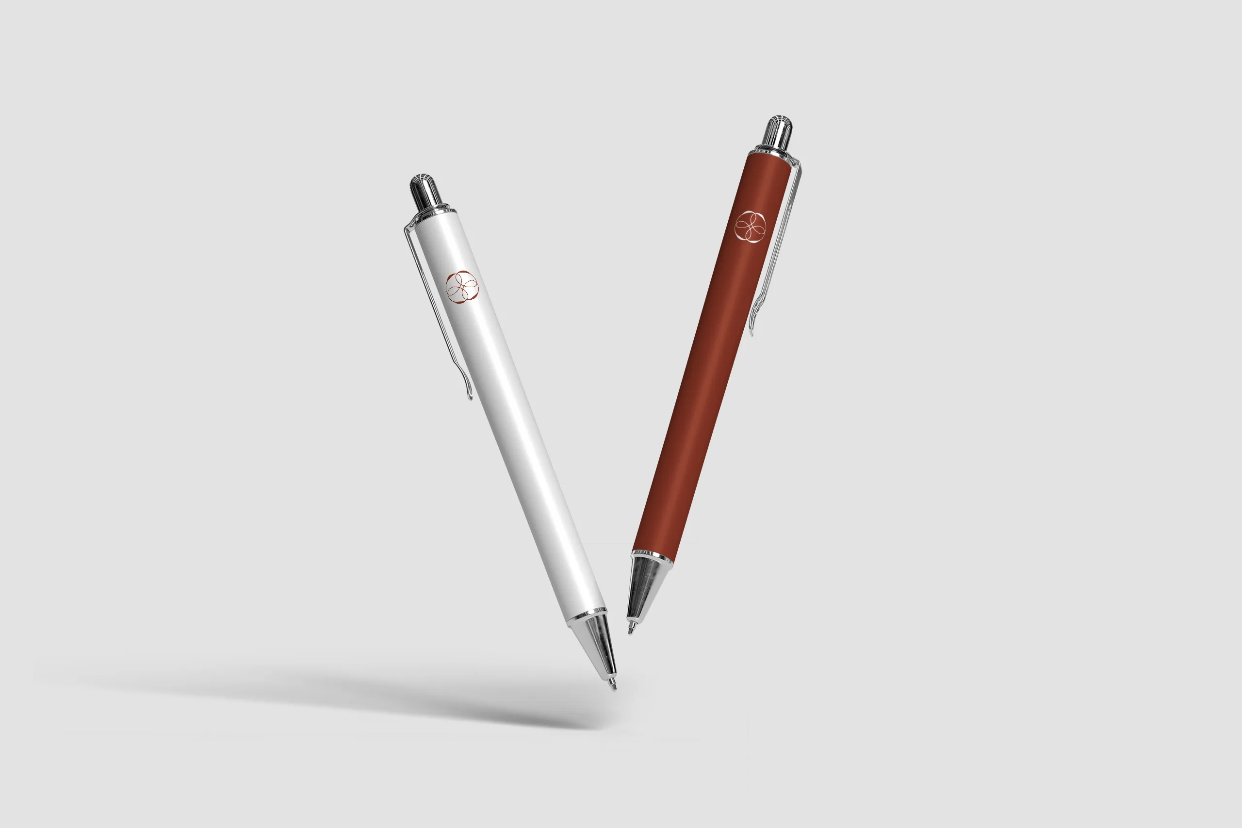
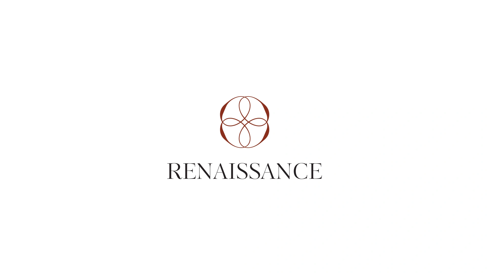
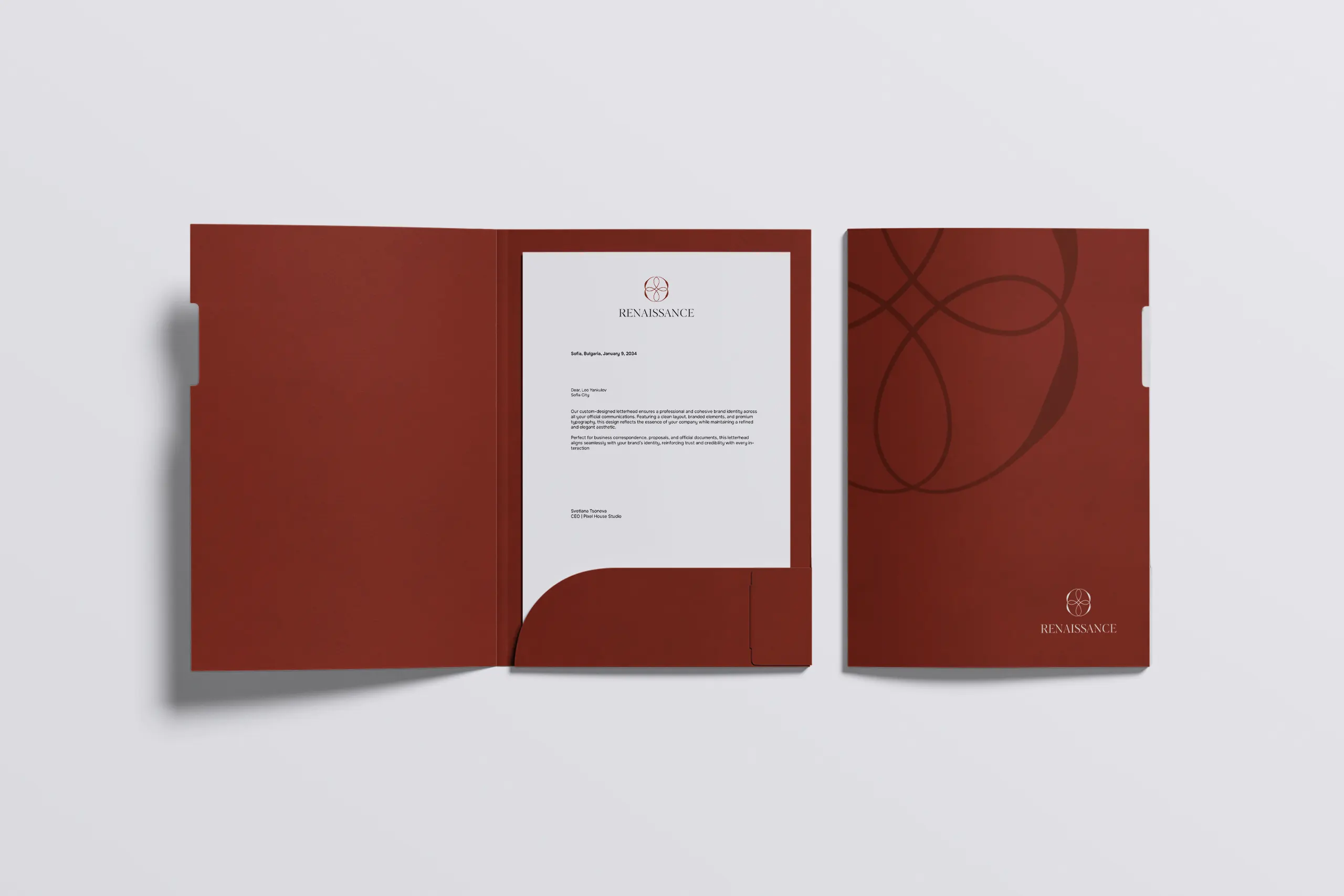
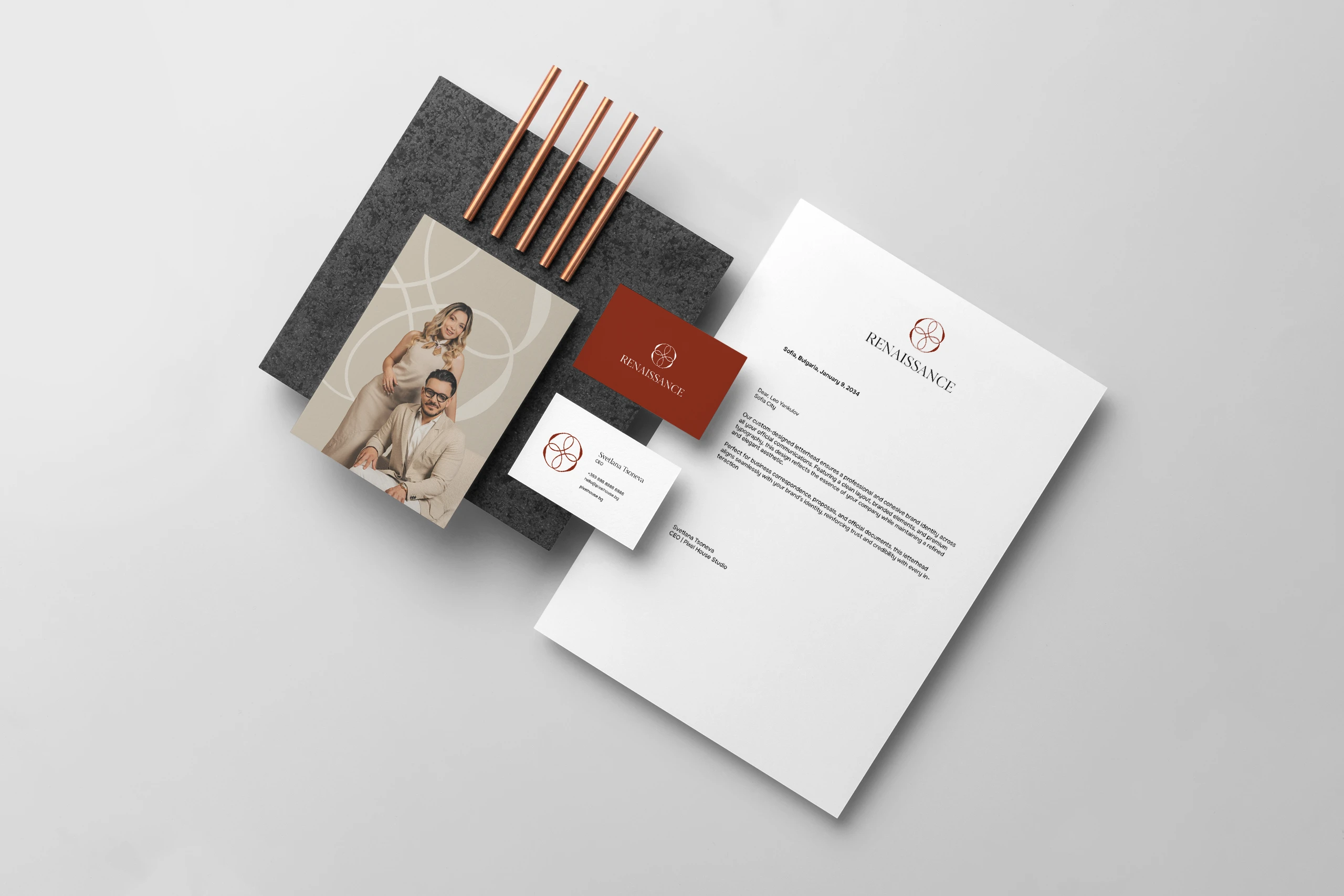
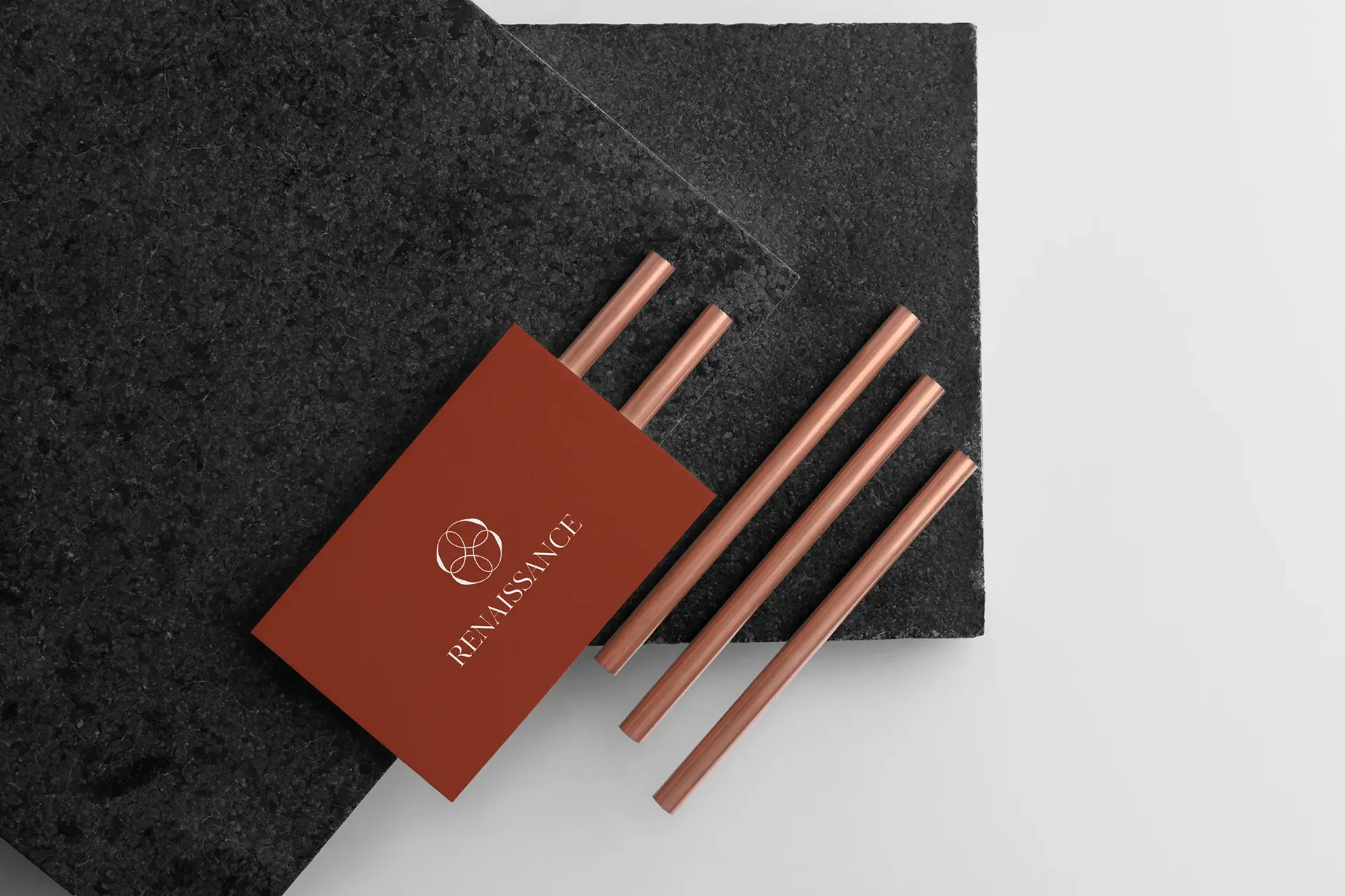
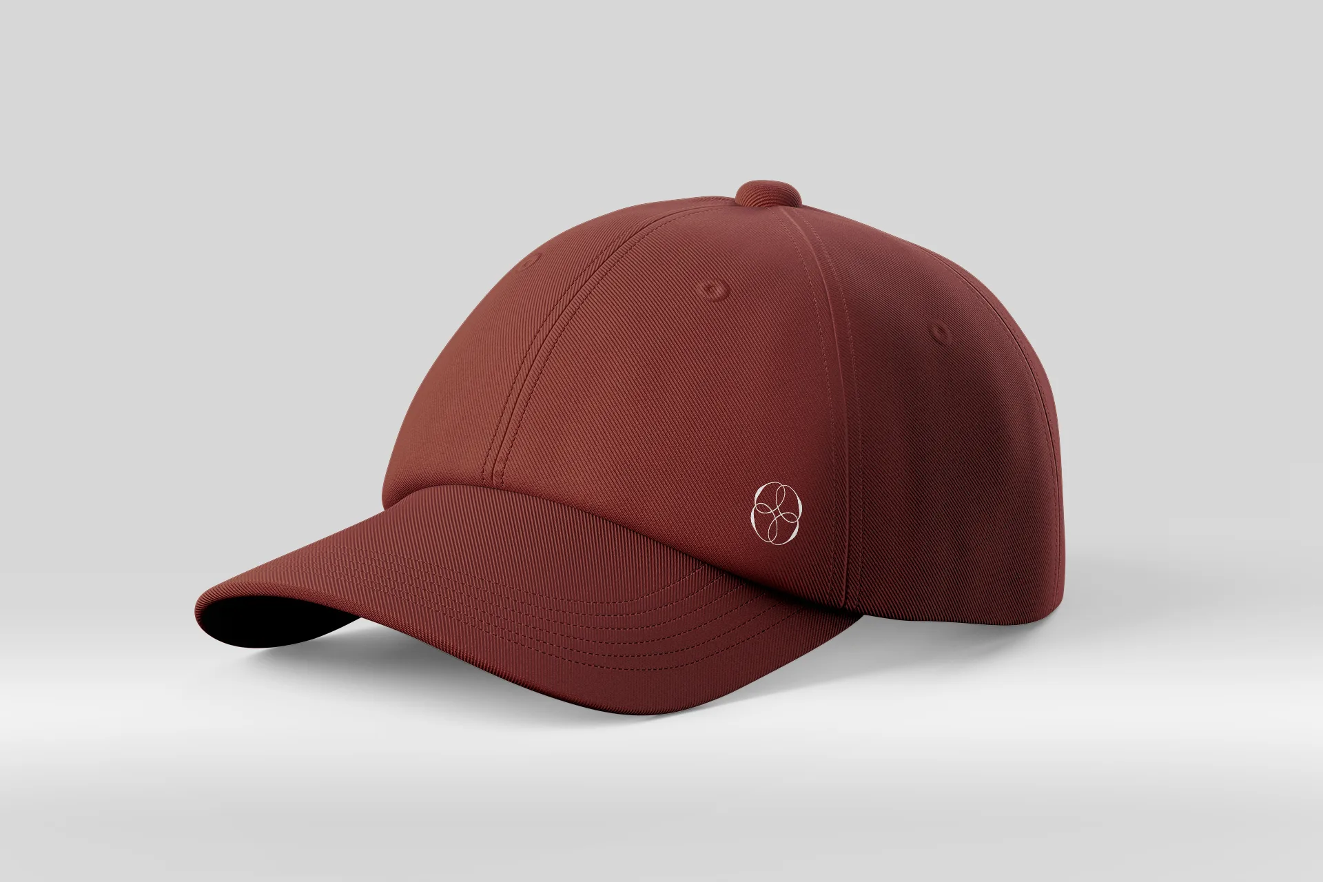
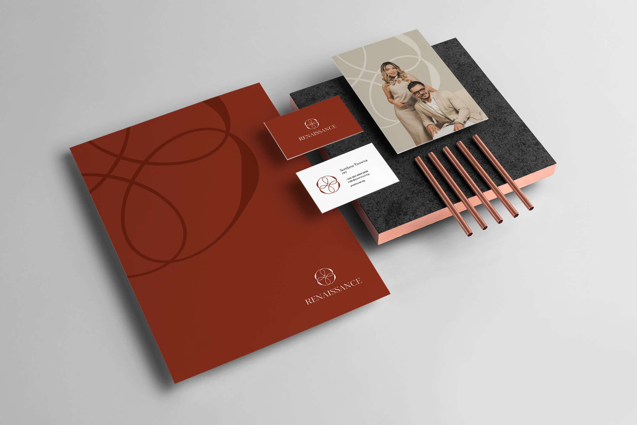
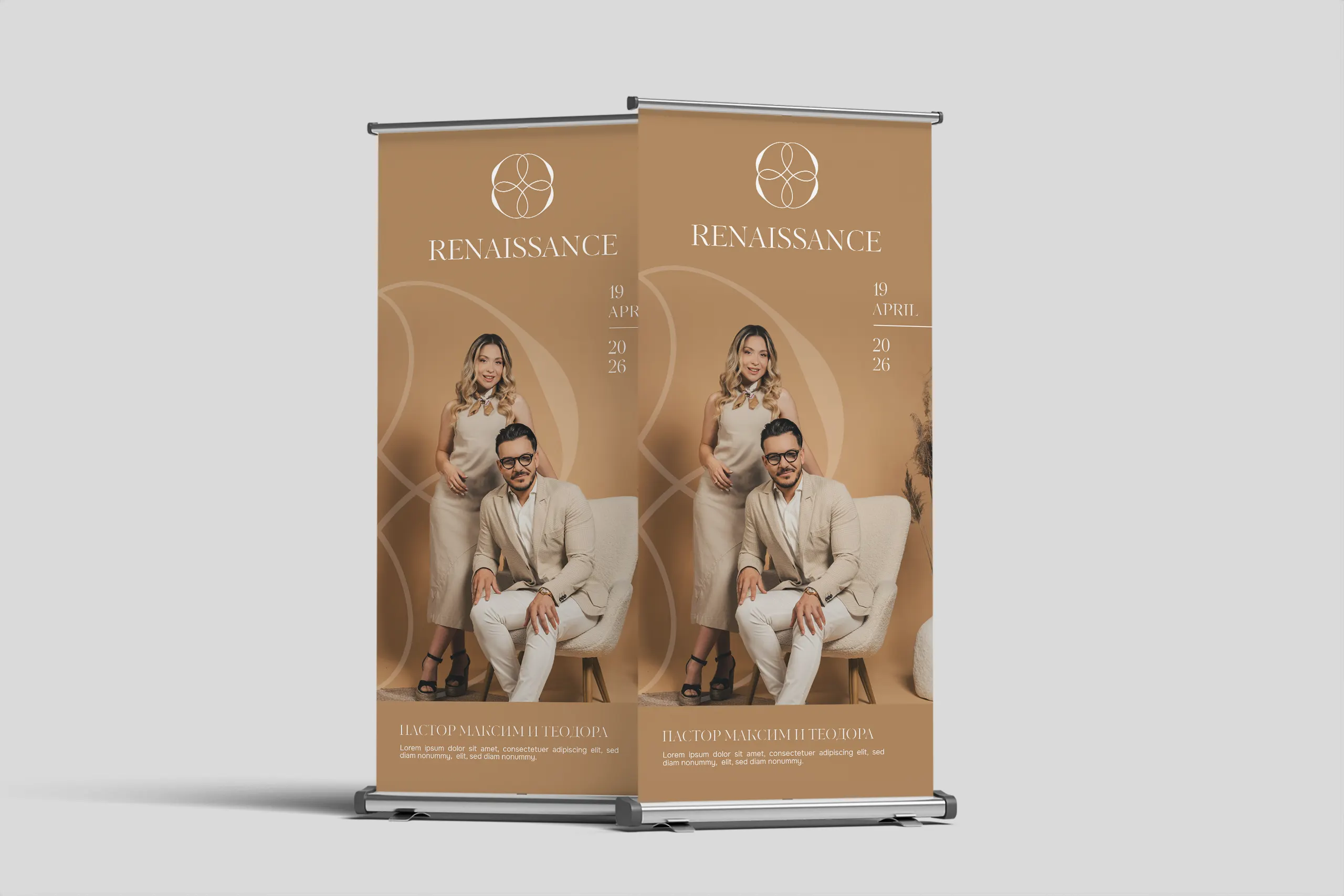
Pixel House created a complete logo redesign and rebranding for Renaissance. The project is inspired by the principles of the Renaissance, where harmony, proportion and balanced composition are the basis of the visual identity. The minimalist logo is developed through geometric shapes inspired by Renaissance architecture and the characteristic arches, which symbolize stability, rhythm and the pursuit of perfect form. The concept is complemented by references to Leonardo da Vinci’s anatomical sketches, recreating the connection between art, architecture and mathematical precision. The warm earthy color palette gives a sense of naturalness, elegance and timeless value.
The project includes the construction of a complete corporate identity, the development of a brand book and the design of advertising materials that guarantee a consistent and recognizable visual presence in all communication channels. Each element is created in accordance with the concept of minimalist design and Renaissance principles, creating a unified visual language with a distinct character. The rebranding establishes Renaissance as a distinctive and memorable brand, combining modern aesthetics, functionality and attention to every detail.
Logo & Redesign


BEFORE
The original logo, so far – with the potential for various improvements such as readability, typography, balance and modern look.
AFTER PIXEL HOUSE
The redesign of the logo – an updated look in line with the brand, clearer typography and improved aesthetics for a stronger visual footprint.

”I highly recommend using the Pixel House services. Their team is devoted, and they are highly responsive and fast during the project. I am impressed by the high quality of the product they offered us and the smooth process. We had a very urgent project, and they gave us an excellent product at the end. If you are seeking professional services, I highly recommend them - whether it's Brand Book Project, Website design and development, or any other service.
Nadya Dimitrova
Brand Manager, Renaissance
Do you want to create a
new brand together?
Or should we rebrand and improve your current brand?
BizDonut Branding
BizDonut Branding

H2O Kids
H2O Kids
Sofel-Mr logo redesign
Sofel-Mr logo redesign
Sematik Branding
Sematik Branding

Imagine You
Imagine You

Solur
Solur
ATG Design logo redesign
ATG Design logo redesign

Meatsome Campaign
Meatsome Campaign
Zero Start
