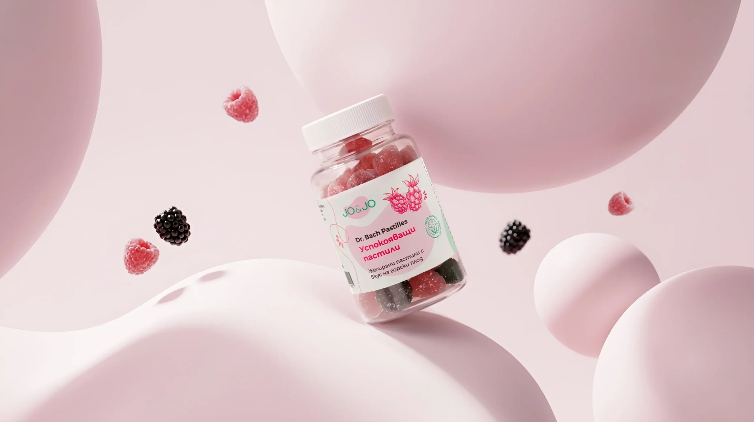

Packaging Psychology: How Design Influences Purchasing Decisions
Imagine you’re standing in a store comparing two similar products. The price is almost the same. The quality appears comparable. You don’t recognize either brand.
Which product would you choose?
In most cases, the decision is made long before you’ve read the information on the label. Your first impression comes from the packaging.
The colors, shape, materials, typography, and overall look and feel create expectations about the product before the customer has even touched or used it.
That’s why packaging design is far more than a decorative element. It’s a powerful marketing tool that directly influences how consumers perceive a product and ultimately decide whether to buy it.
Why Is Packaging So Important?
Packaging is often the very first interaction between a customer and a brand.
In the digital world, this might be a product image in an online store. In a physical retail environment, the packaging literally competes for attention among dozens or even hundreds of products on the shelf.
In many cases, customers spend only a few seconds deciding whether a product deserves their attention. Within those few seconds, the packaging design has to do its job.
Well-designed packaging can:
- Increase the product’s perceived value
- Build trust in the brand
- Differentiate the product from competitors
- Create an emotional connection
- Encourage purchase decisions
People Buy with Emotion and Justify with Logic
This is one of the most important principles in marketing. As rational as we like to believe our decisions are, many of them are driven by emotion. When we see a product that looks premium, we naturally assume it’s of higher quality.
On the other hand, when packaging looks cheap or poorly designed, we often transfer that impression to the product itself. This is why two companies can sell very similar products at different price points. One invests in the overall brand experience and communication, while the other relies solely on functionality.
How Colors Influence Perception
Color is one of the most powerful tools in packaging design.
It communicates messages before the customer has even read a single word.
- Green is often associated with nature, organic products, and sustainability.
- Blue creates a sense of trust, cleanliness, and reliability.
- Black conveys luxury, premium quality, and elegance.
- Red captures attention and evokes energy and excitement.
Of course, there’s no universal formula. The right color palette should align with the product, the target audience, and the brand’s positioning.
Materials Speak Too
When thinking about packaging, it’s easy to focus only on the visual design. However, the material is just as important. A heavy glass bottle creates a completely different impression from lightweight plastic packaging. Embossed printing feels different from a standard label.
Matte finishes communicate differently than glossy ones. Every detail influences how consumers perceive the quality and value of the product.
Shape Can Make a Product Stand Out from a Distance
Sometimes, the strongest competitive advantage isn’t the graphic design—it’s the shape of the packaging itself. A distinctive form makes a product easier to recognize and more memorable. It can also improve the user experience by making the product easier and more enjoyable to use.
Great packaging design always combines aesthetics with functionality.
Why Does Minimalism Work So Well?
In recent years, more and more premium brands have embraced minimalist packaging design.
The reason is simple.
When everything is competing for attention, calm and confident design naturally stands out. Minimalist packaging often conveys quality, confidence, and a clearly defined brand position. This doesn’t mean every brand should be minimalist. It means every design element should have a clear purpose.
The Most Common Packaging Design Mistakes
One of the most common mistakes is trying to communicate everything at once.
- Too much text.
- Too many colors.
- Too many graphic elements.
As a result, customers struggle to identify the product’s main message. Another common mistake is copying competitors. While this may seem like a safe strategy, it makes the product much harder to distinguish on the shelf. Successful brands don’t simply follow the market—they create their own visual language.
How Great Packaging Increases Product Value
Investing in professional packaging design often delivers significant returns.
Customers are generally willing to pay more for products that appear higher in quality, more trustworthy, and better presented. This doesn’t mean creating artificial value. It means presenting the genuine quality of the product in a way that customers immediately understand and appreciate.
Packaging is the bridge between the product itself and the way it is perceived.
What Makes Packaging Successful?
Successful packaging is more than just attractive.
- It captures attention.
- It communicates clearly.
- It reflects the brand’s personality.
- It builds trust.
- It remains memorable.
Most importantly, it helps the product get chosen.
In a world where consumers are exposed to countless products and marketing messages every day, first impressions matter more than ever.
Packaging design is much more than a visual wrapper. It’s a strategic tool for communication, trust-building, and driving sales.
Well-designed packaging doesn’t simply present a product—it tells a story, creates an emotional connection, and helps customers make confident purchasing decisions.
That’s why investing in professional packaging design isn’t an expense. It’s an investment in how the market perceives your product.
At Pixel House, we believe that good packaging is much more than just a pretty face.
It is the first impression a product makes, and often the reason a customer chooses it. We create packaging designs that represent your brand in the best way and turn ideas into products that stand out.


Implemented projects

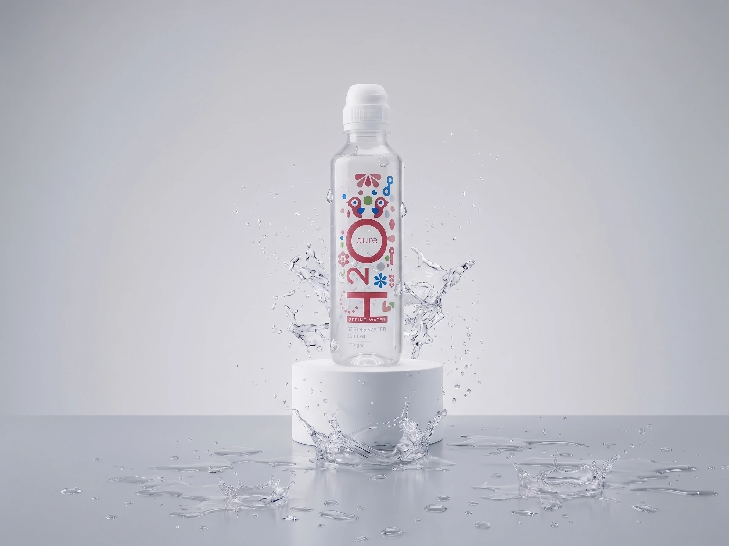
H2O Pure water

My Lavanda Artisanal Soap

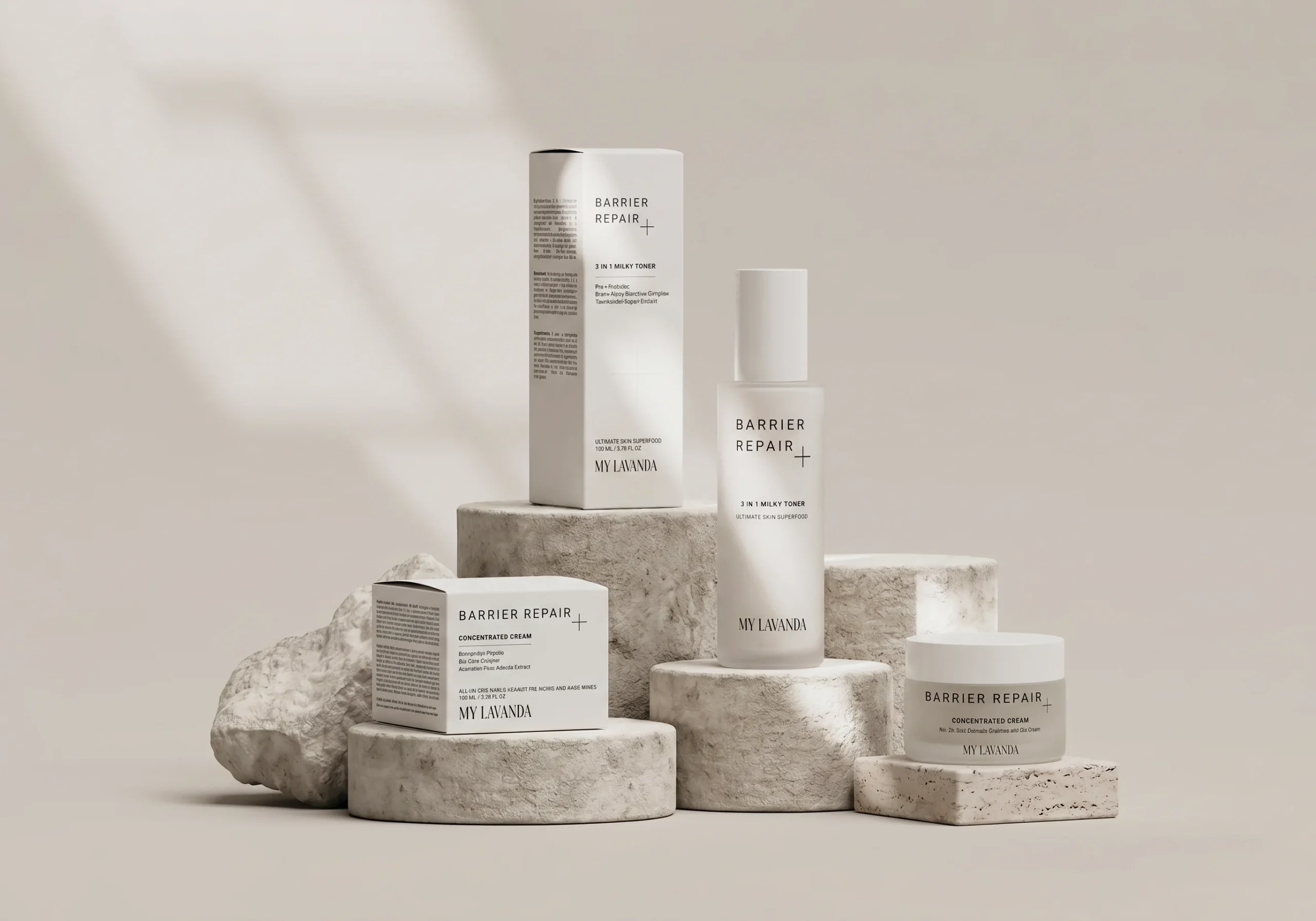
My Lavanda Barrier repair

Ovoron

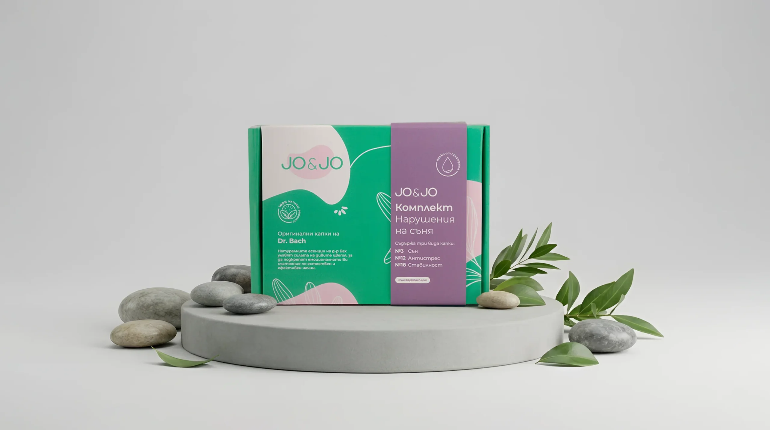
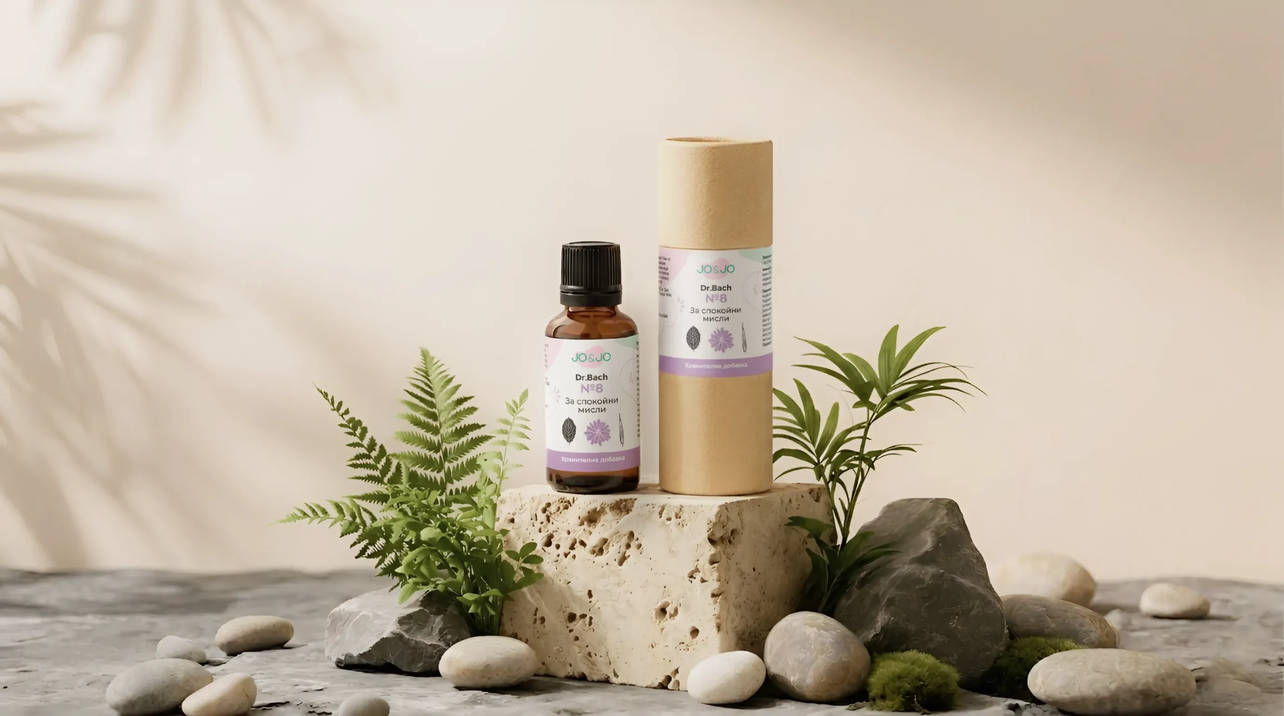
Jo&Jo packaging design

H2O Kids

Fermata Packaging Design

Vitrogen